

We are focusing on giving the WY-VIEW Dashboard a fresh look and feel. The updates are to focus on Assessments (State & Local), Early Warning, and Growth and displaying relevant high-level data. The ability to drill down into detail along with historical graphs for evaluation of student, school, and district performance will continue to be a crucial feature.
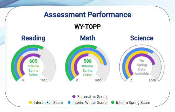
From a student’s page, it’s now easier than ever to see how a student has performed on their prior year’s summative assessment as well as all their current year’s interim assessments. The ability to dig down deeper into how they’ve performed by objective or view historical charts will remain.

From a school page, your historical assessment data is shown next to how your district performed as a whole.

One of the hits from Covid was the need to halt state assessments. Since student growth percentiles require two years of assessment scores they were delayed as well but not any longer.
A student growth percentile describes a student’s growth compared to other students with similar prior test scores (their academic peers). Although the calculations for SGPs are complex, percentiles are a familiar method of measuring students in comparison to their peers. Growth is distinct from achievement; a student can achieve at a low level but still improve relative to his/her academic peers.
These important SGP visuals can be found right on the new student overview tab.

In the above image, you can see the district had only 31.9% of its students meeting the performance level when the district’s goal was that 90% of its students should perform at or above the 70th “Percentile at School” for this assessment. Assessment data follows a student similar to transcript data, thus a district or school will see historical data for transfer students into their district. This is quite useful at the teacher level working with a student yet can be unclear at the school and district level. We would be glad to work with your district to publish historical data to provide a more complete historical view if/when this occurs in your district.

In this image, you can see this student performed below the 50th Percentile at School for this assessment when the defined level for a student taking aReading was the 70th Percentile.
In addition, this student visualization provides data for “Percentile at School” and “Percentile at Nation” comparison as well as indication of how the student performed against the school level performance target that students achieve at the 70th Percentile via the red/green coloring.

Social Media